Calligraphy can give a short line of text the presence of a custom illustration. The challenge is matching that personality to the job: delicate flourishes can make an invitation feel special, while a heavier script may be the better choice for a poster or food label. These ten fonts span both ends of that range.
Before choosing one, set your actual words in the typeface. Check the capital letters, the joins between letters, and how the design holds up at its final size. A beautiful sample alphabet does not always make a readable logo or headline.
Quick picks
| Design goal | Font to try |
|---|---|
| Relaxed, personal lettering | Handwriting Font |
| Vintage romance | Bellinda |
| Light, sweeping elegance | Chemistry |
| Friendly, high-impact headlines | Butter Donat |
| A script and serif pairing | Gervia |
| Bridal and boutique identities | Elizabeth |
| Dramatic luxury lettering | Salistya |
| Dark, expressive posters | Lovely Madness |
| A clear, rounded script | Dentany |
| Energetic promotional work | Ballistisia |
Handwriting Font
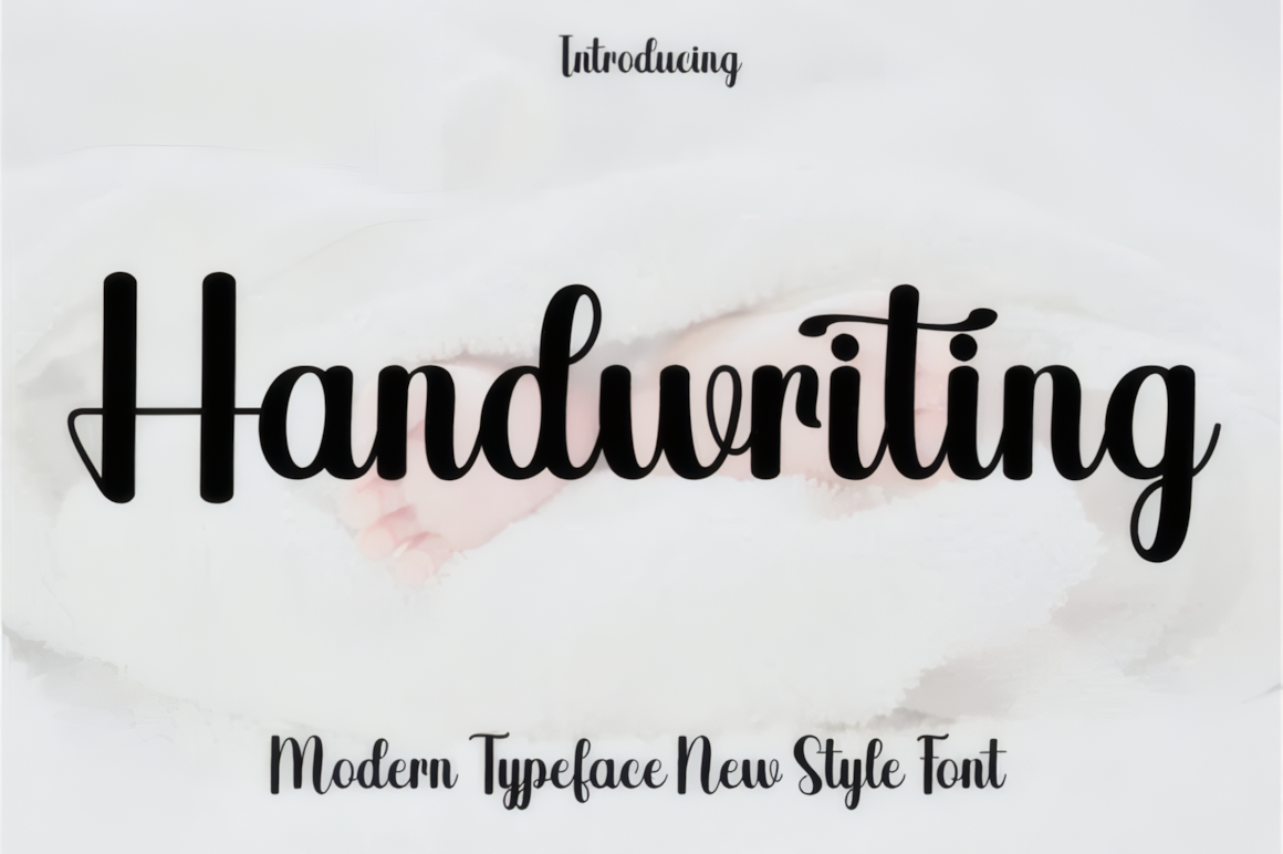
Handwriting Font has rounded, connected letters and an informal rhythm. It is a useful starting point for a personal logo, a short quote, or stationery that should feel welcoming. The included alternates can keep repeated letters from looking identical. Give the taller loops room around the wordmark, and pair the script with a quiet typeface for small details.
Bellinda
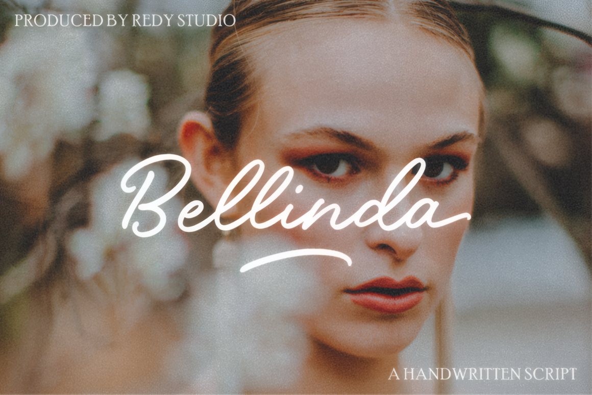
Bellinda brings a softer, nostalgic tone. Its looping forms and swashes suit beauty branding, wedding stationery, and packaging that calls for a handwritten signature. Use the decorative characters selectively: one flourish on a name often makes a stronger impression than embellishing every word. The source describes the extra glyphs as PUA encoded, which can make them accessible in many design applications.
Chemistry
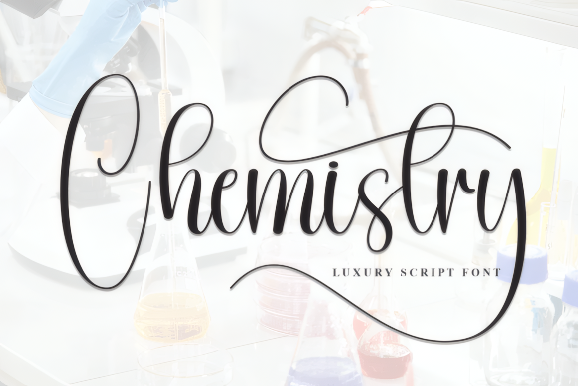
Chemistry is a slender script with tall letters and long, airy extensions. Try it for a short invitation heading, a name card, or a beauty label where generous whitespace is part of the design. Its fine strokes need a clean background and a size large enough to keep the lettering distinct. For a complete layout, let a simpler serif or sans serif carry the practical information.
Butter Donat
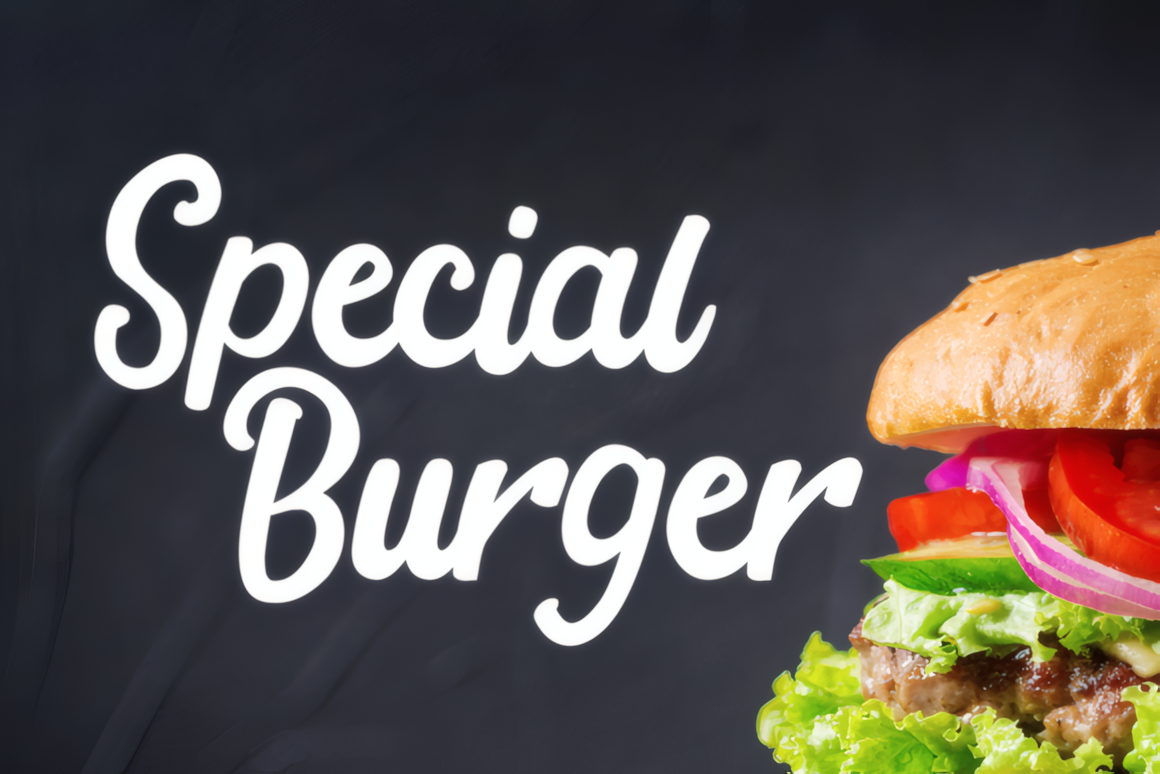
Butter Donat changes the mood entirely. Rounded, substantial strokes give this cursive font the visibility needed for café menus, snack packaging, and playful promotions. It can take the lead in a big headline without relying on fine details. Keep the phrase short and leave space between surrounding elements so the connected letters do not crowd the composition.
Gervia
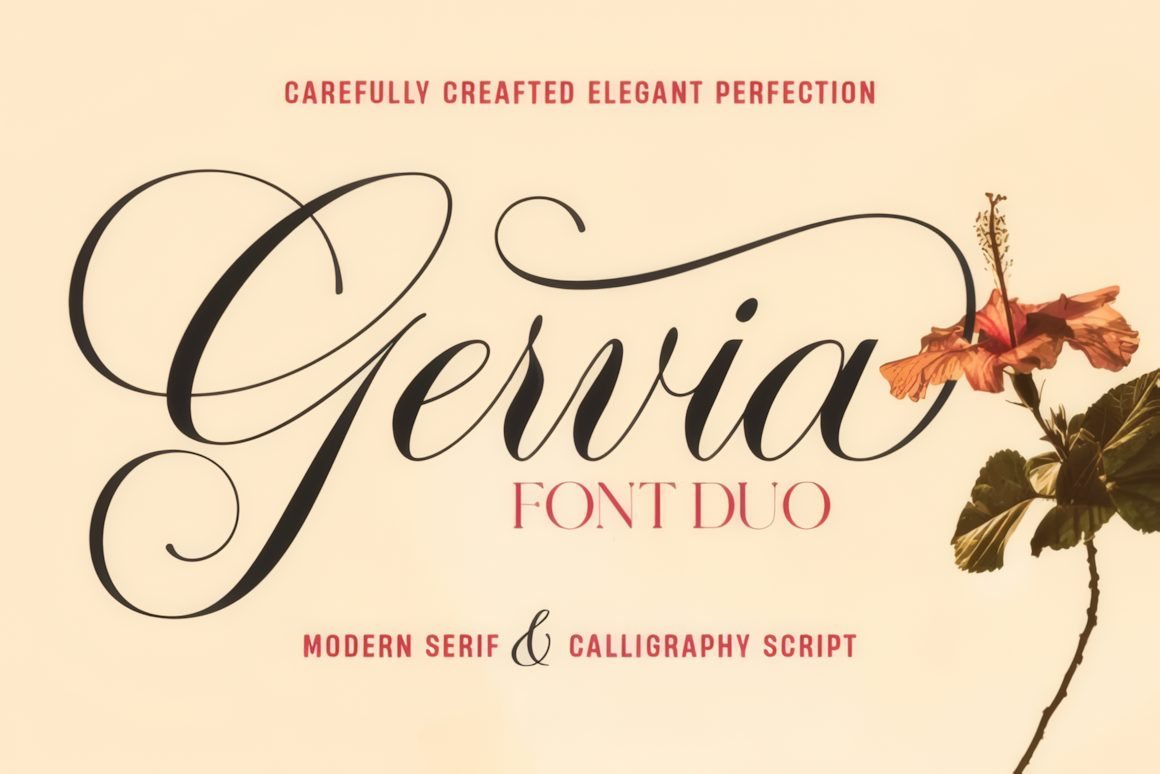
Gervia is a font duo: an expressive calligraphy script is paired with a more structured serif. That makes it especially practical for invitations, editorial covers, and premium packaging. Use the script for the name or main title, then move dates, descriptions, and other supporting text into the serif. The script also offers a large set of alternates for tailoring prominent words.
Elizabeth
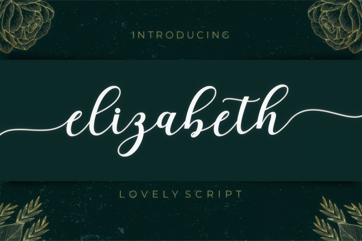
Elizabeth offers a polished signature look for bridal stationery, boutique branding, and elegant product labels. Its connected lowercase letters keep a word flowing, while longer swashes add emphasis to names and brief headlines. Reserve those extensions for display sizes; a clean companion font will make prices, dates, and other small text easier to scan. The source lists PUA encoded decorative glyphs.
Salistya
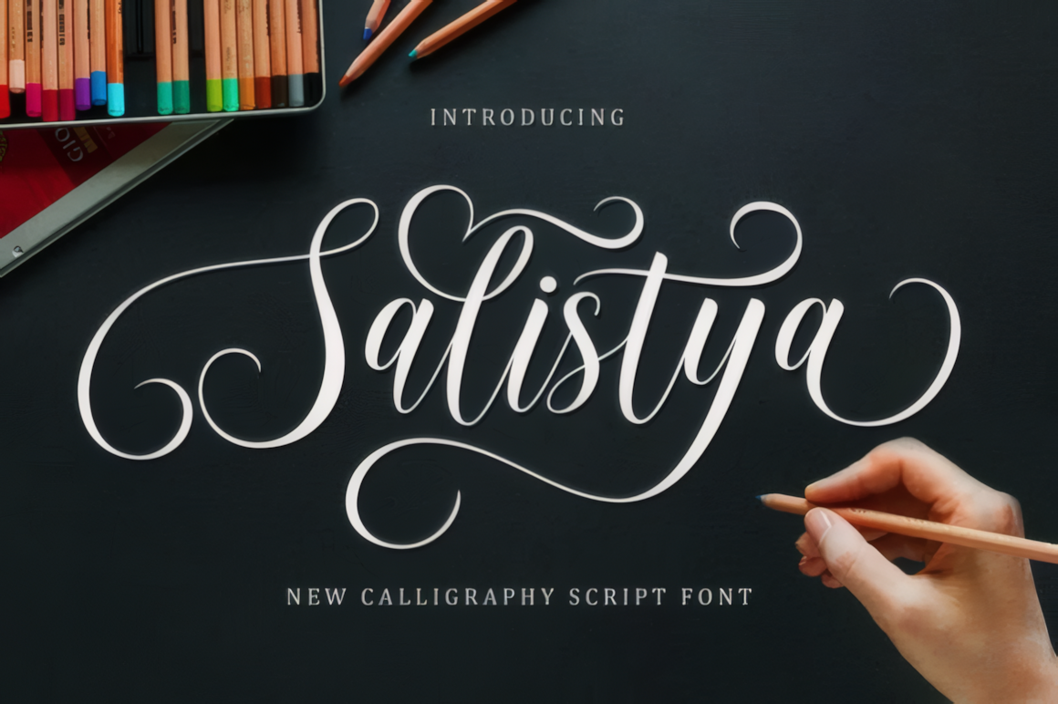
Choose Salistya when the typography should feel theatrical and refined. Slim strokes and extended flourishes give short names a luxurious finish, making the font suitable for a wordmark, invitation cover, or premium package. Those same details can disappear or collide at small sizes, so test the exact wording before committing to a logo. A restrained serif or sans serif provides a useful counterweight.
Lovely Madness
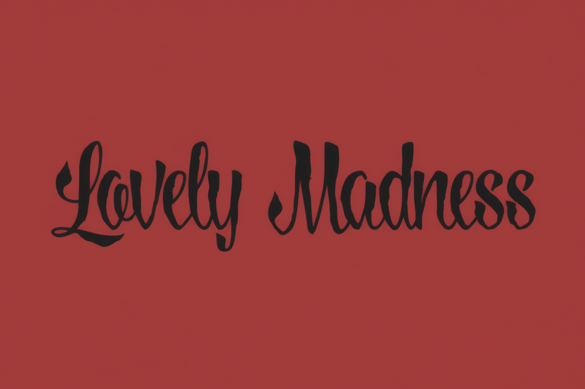
Lovely Madness is the outlier in this collection. Its rougher edges and irregular movement bring character to Halloween artwork, music graphics, and alternative branding. Use it as a deliberate focal point in a short title; longer copy will be easier to read in a conventional typeface. The contrast between an unruly headline and orderly supporting text can make the design feel intentional.
Dentany
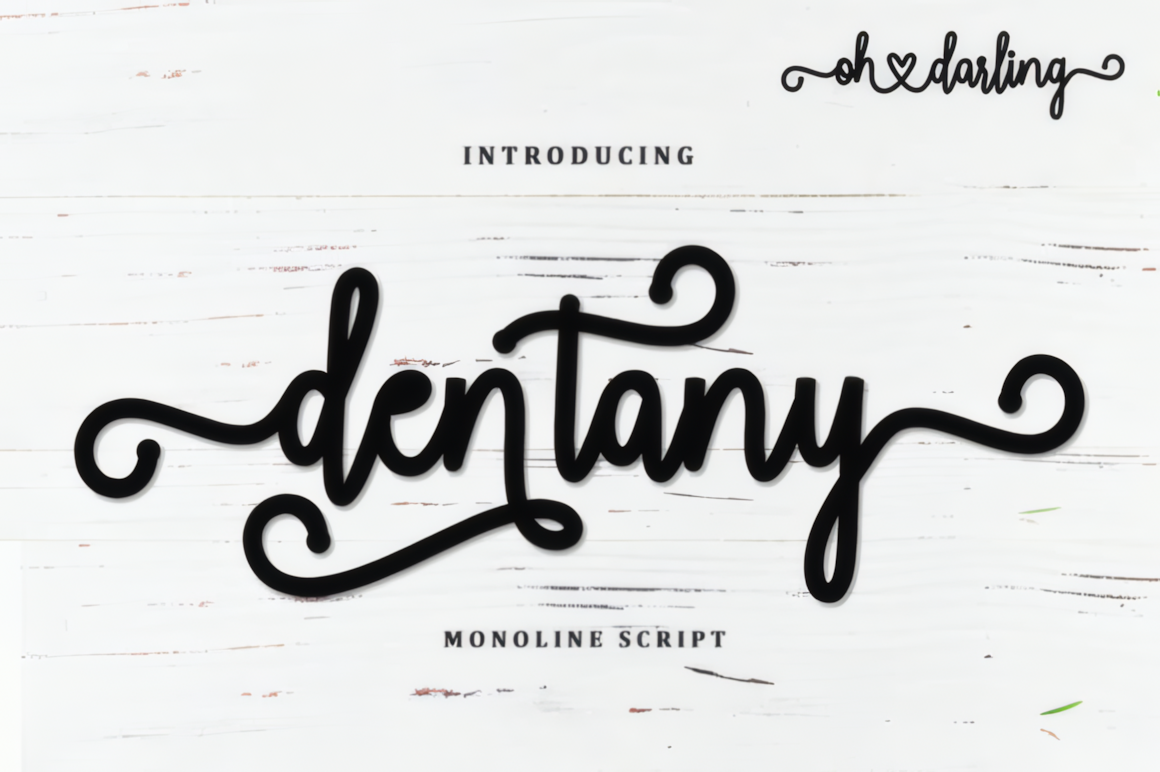
Dentany uses an even, rounded stroke that gives its decorative script a friendly, legible base. It works for greeting cards, restaurant branding, couple names, and romantic packaging. The curled details are most useful in short display text, where they can be appreciated without competing with nearby words. For menus or labels, combine it with a straightforward sans serif for the information customers need to read quickly.
Ballistisia
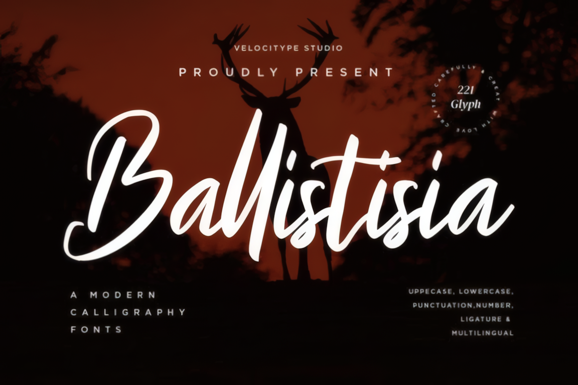
Ballistisia has more force than the quiet wedding scripts above. Sweeping capitals, prominent strokes, and a brush-like texture can energize posters, merchandise, and promotional graphics. It is best treated as a headline font: set a few words large, then use a simpler family for the message beneath. The source lists ligatures and multilingual support, useful details to verify against your specific project language.
How to choose
Start with the setting, not the prettiest preview. For a wedding name, compare Bellinda, Elizabeth, and Salistya at the size they will appear in print. For a bold commercial headline, test Butter Donat and Ballistisia. If the design needs both a decorative title and coordinated supporting text, Gervia gives you a ready-made pairing.
Finally, check the font's current license and included characters on its product page before using it in client work or products for sale.
Disclosure: This article contains affiliate links to Creative Fabrica. If you purchase through them, fonts.blog may earn a commission at no extra cost to you.