Choosing from cool sans serif fonts starts with the job your typography must do. Consider the words, their final size, and the mood of the project. The options below are organized to help you compare useful directions before testing candidates in your own layout.
- How to evaluate the options
- At a glance
- Font picks
- Sourced Font for logos
- Strave Font for branding
- Polaroid Font for headlines
- Cinema Font for logos
- Nothing Font for logos
- Godplan Font for posters
- Hoodie Font for posters
- Edition Font for headlines
- Morein Font for logos
- Blush Font for branding
- Robusta Font for branding
- Muffin Font for headlines
- Rolling Font for branding
- Nura Font for posters
- Olline Font for branding
- Modern Heritage Font for branding
- Borsen Font for logos
- Agilov Font for logos
- Montreal Font for branding
- Vankis Font for logos
- Heroes Font for logos
- Sogo Font for logos
- Mansory Font for website headers
- Final checks before using a font
How to evaluate the options
Set the real headline, name, or label in each candidate. Check legibility at the final size, compare the capitals and repeated letters, and leave enough room for decorative details. Use a quieter companion font for long descriptions and other supporting text.
At a glance
| Font | Good starting point |
|---|---|
| Sourced Font | logos, branding |
| Strave Font | branding, packaging |
| Polaroid Font | headlines, posters |
| Cinema Font | logos, posters |
| Nothing Font | logos, branding |
| Godplan Font | posters, headlines |
| Hoodie Font | posters, headlines |
| Edition Font | headlines, posters |
| Morein Font | logos, packaging |
| Blush Font | branding, T-shirts |
| Robusta Font | branding, packaging |
| Muffin Font | headlines, logos |
| Rolling Font | branding, packaging |
| Nura Font | posters, headlines |
| Olline Font | branding, logos |
| Modern Heritage Font | branding, website headers |
| Borsen Font | logos, branding |
| Agilov Font | logos, branding |
| Montreal Font | branding, website headers |
| Vankis Font | logos, branding |
| Heroes Font | logos, branding |
| Sogo Font | logos, branding |
| Mansory Font | website headers, display text |
Font picks
Sourced Font for logos
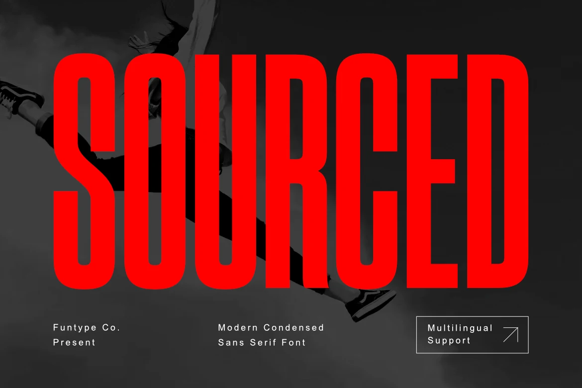
Sourced Font is worth testing for logos, branding, and posters. Look for rounded letter shapes and narrow proportions when comparing it with other options. Try it at both headline and label size to judge its clarity.
Strave Font for branding
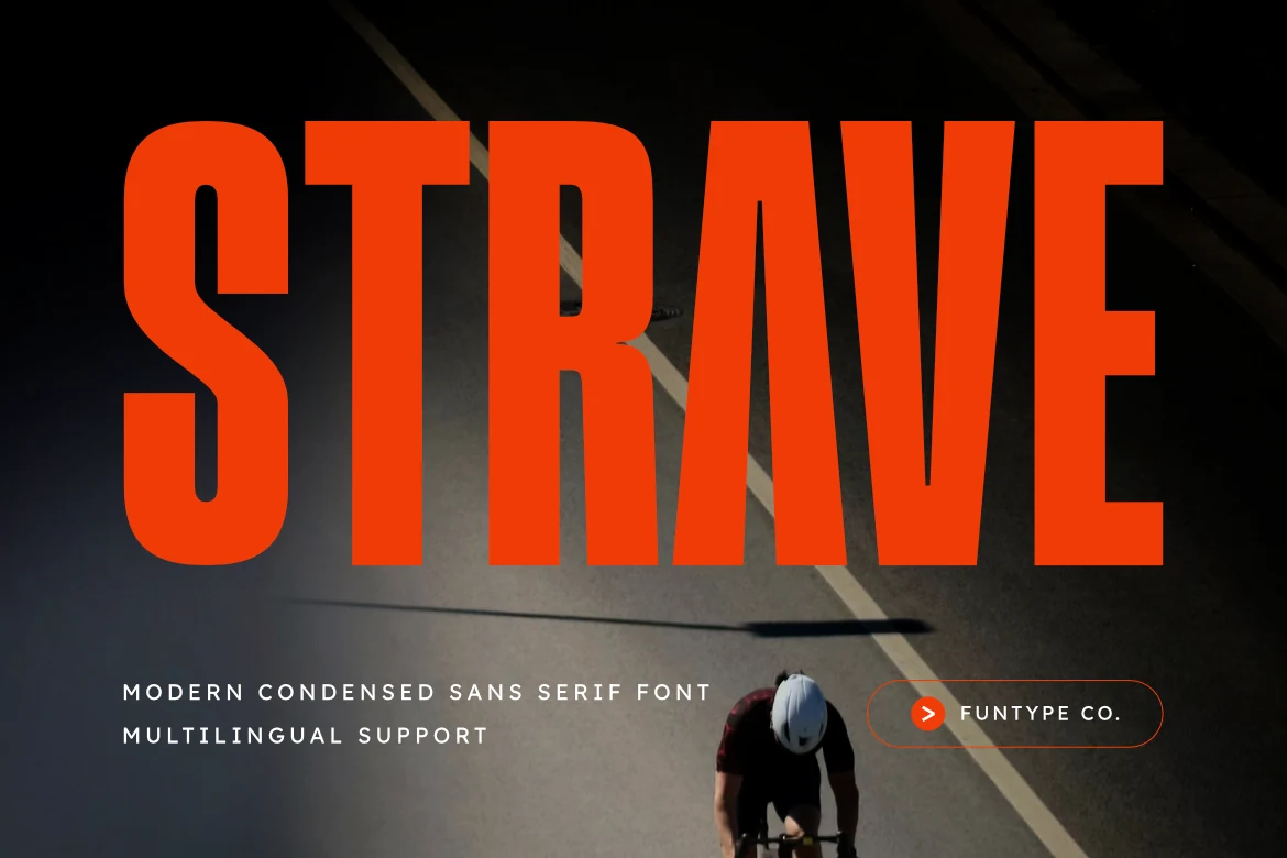
For branding, packaging, and posters, consider Strave Font. Its design draws on narrow proportions and serif details. Compare the width and spacing in your intended layout.
Polaroid Font for headlines
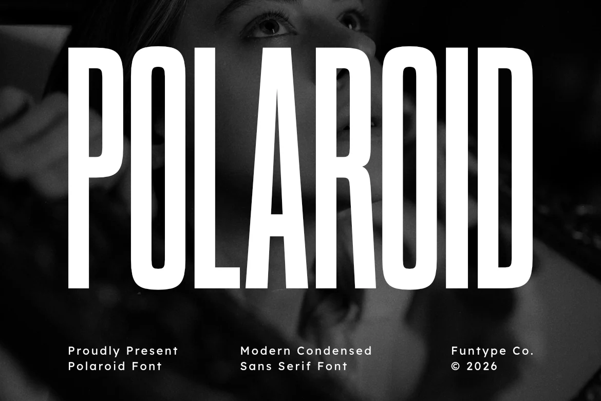
Polaroid Font can anchor headlines, posters, and branding. The main visual cues are narrow proportions and geometric construction. Compare the width and spacing in your intended layout.
Cinema Font for logos
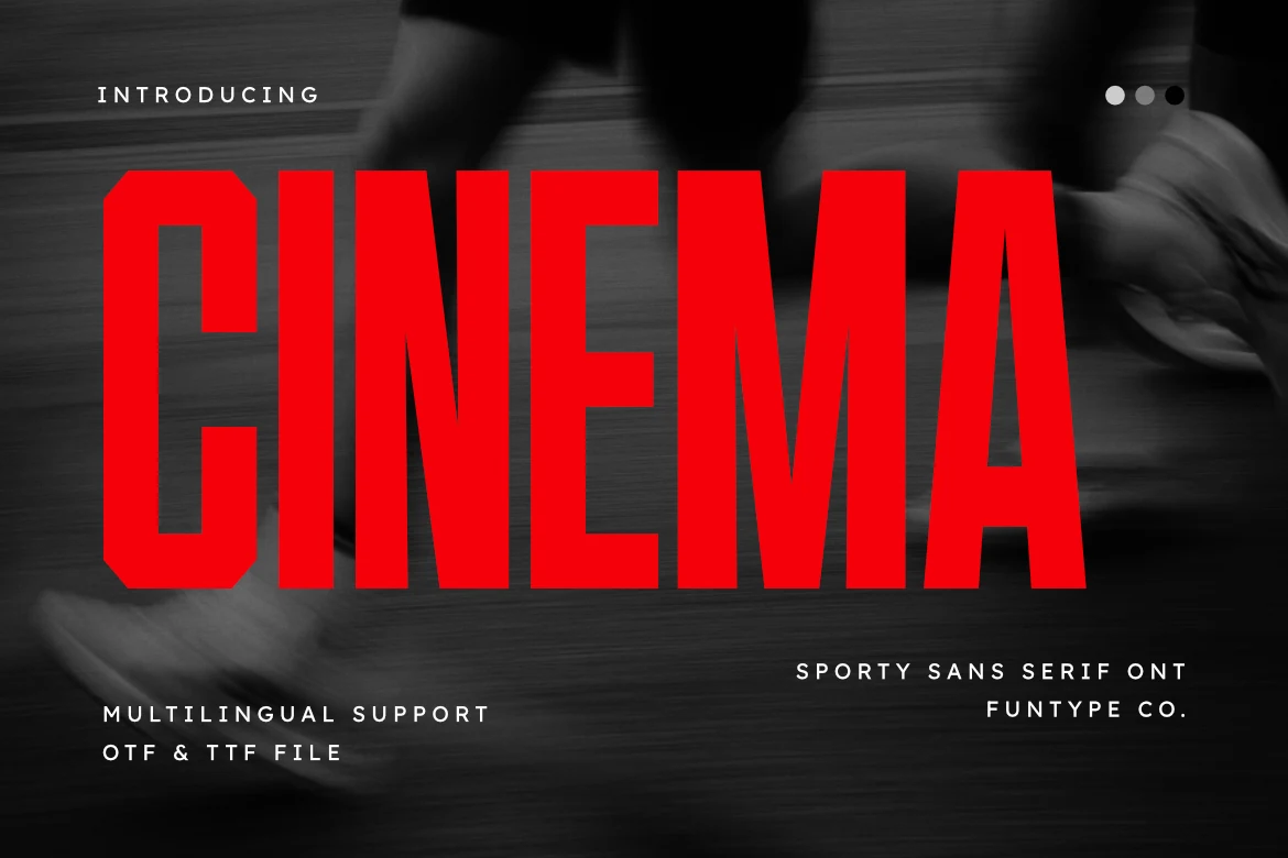
Cinema Font is worth testing for logos, posters, and T-shirts. Look for narrow proportions and display-focused letterforms when comparing it with other options. Compare the width and spacing in your intended layout.
Nothing Font for logos
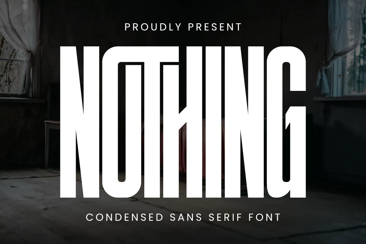
For logos, branding, and posters, consider Nothing Font. Its design draws on geometric construction. Check whether repeated shapes make short words feel balanced.
Godplan Font for posters
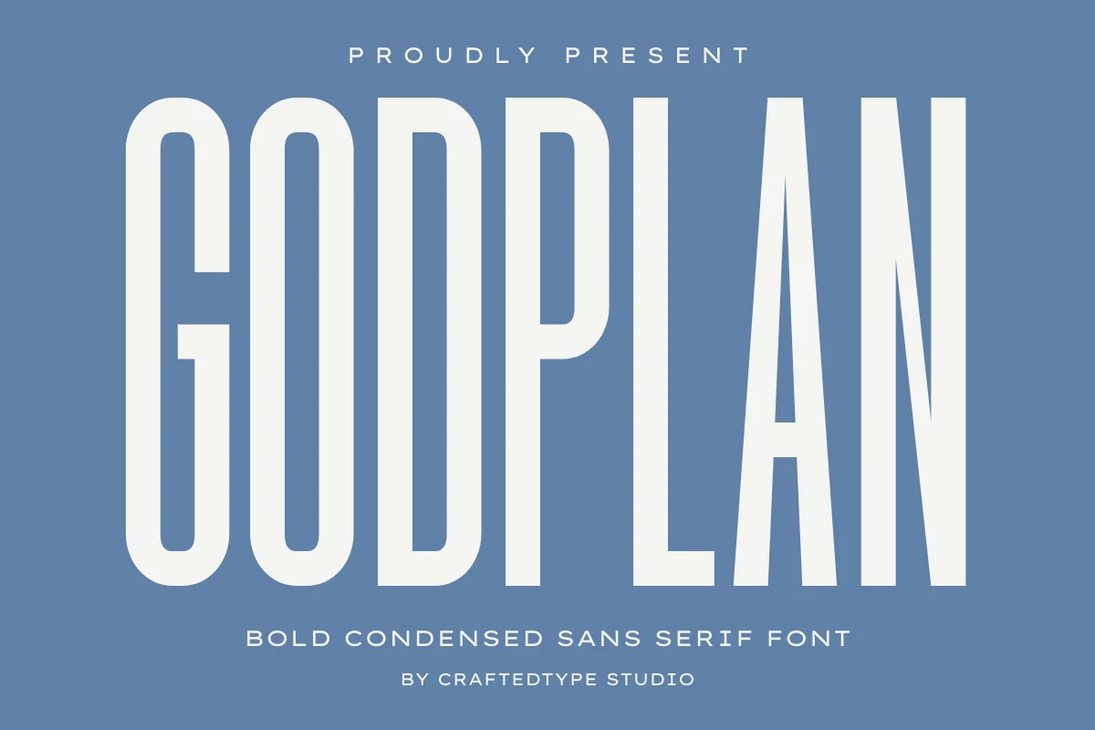
Godplan Font can anchor posters, headlines, and display text. The main visual cues are narrow proportions and serif details. Compare the width and spacing in your intended layout.
Hoodie Font for posters
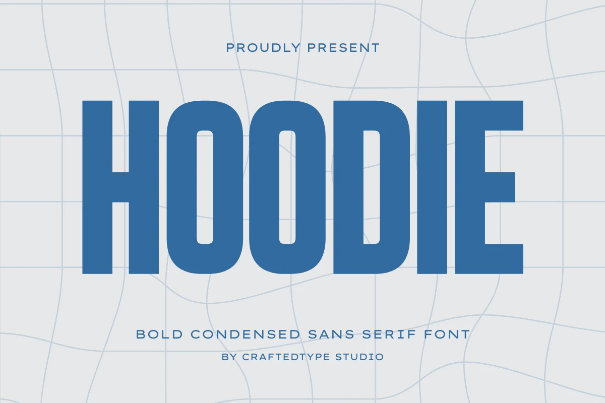
Hoodie Font is worth testing for posters, headlines, and logos. Look for narrow proportions and geometric construction when comparing it with other options. Compare the width and spacing in your intended layout.
Edition Font for headlines
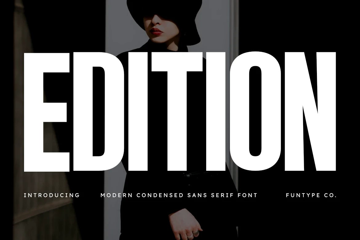
For headlines, posters, and branding, consider Edition Font. Its design draws on narrow proportions and serif details. Compare the width and spacing in your intended layout.
Morein Font for logos
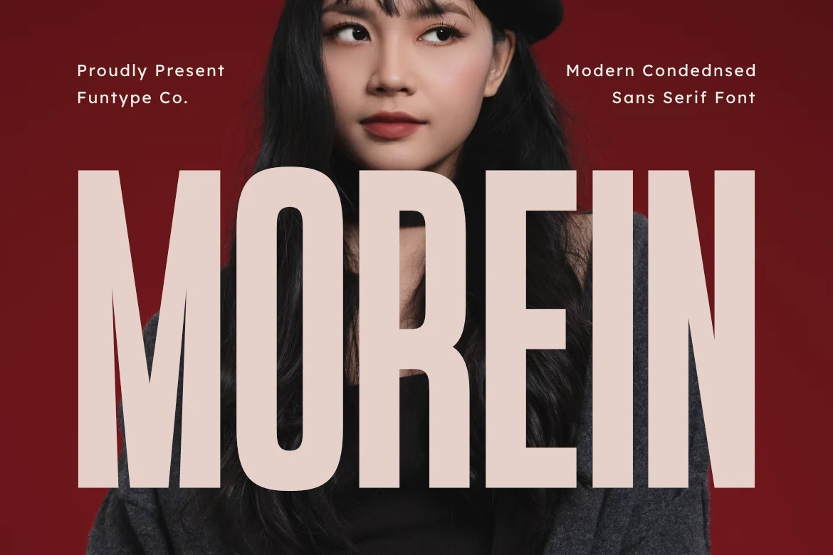
Morein Font can anchor logos, packaging, and posters. The main visual cues are narrow proportions and serif details. Compare the width and spacing in your intended layout.
Blush Font for branding
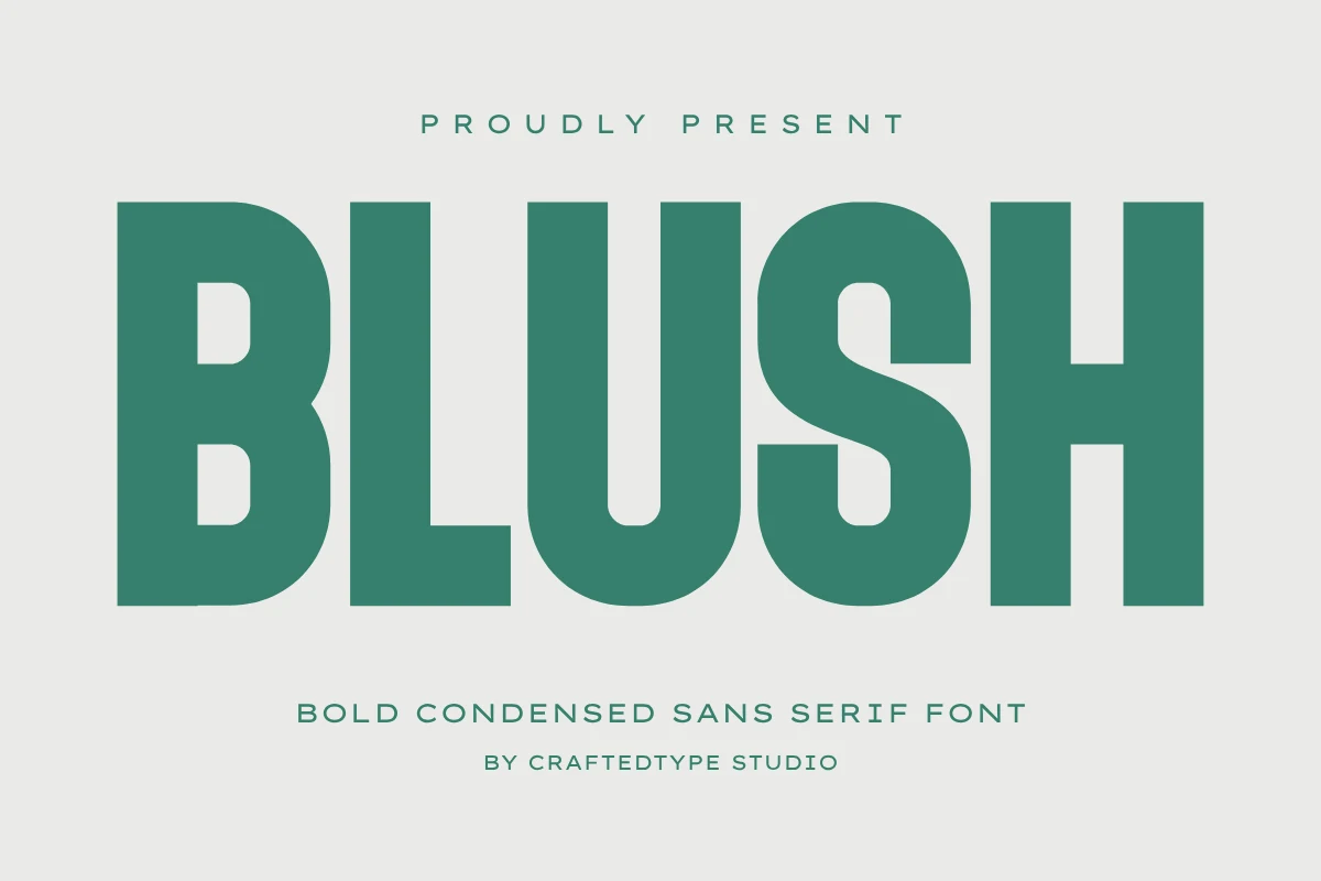
Blush Font is worth testing for branding, T-shirts, and posters. Look for narrow proportions and geometric construction when comparing it with other options. Compare the width and spacing in your intended layout.
Robusta Font for branding
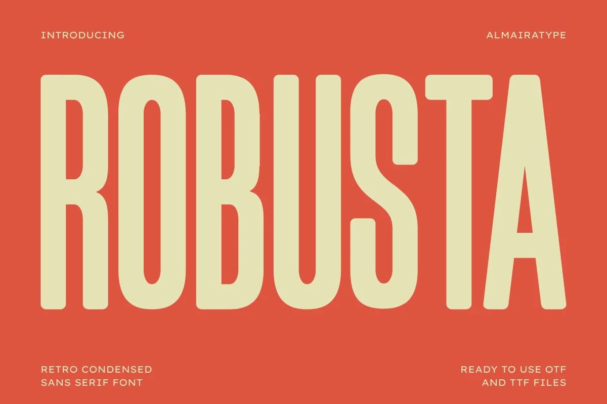
For branding, packaging, and social media graphics, consider Robusta Font. Its design draws on rounded letter shapes and narrow proportions. Try it at both headline and label size to judge its clarity.
Muffin Font for headlines
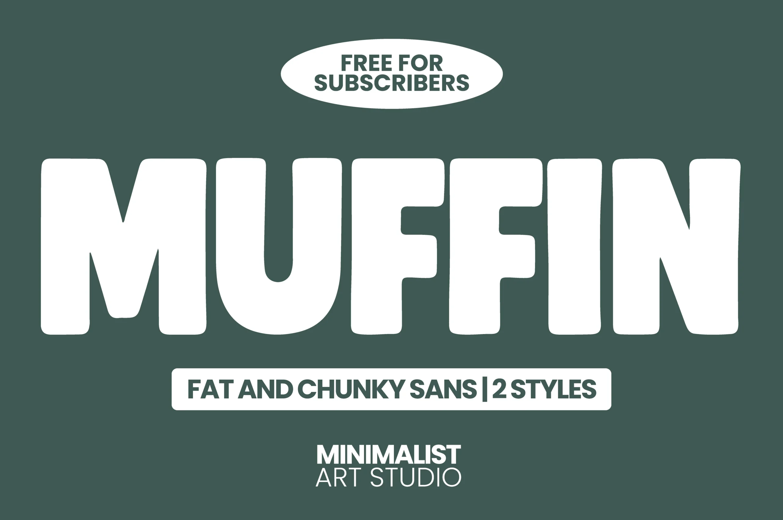
Muffin Font can anchor headlines, logos, and packaging. The main visual cues are rounded letter shapes and narrow proportions. Try it at both headline and label size to judge its clarity.
Rolling Font for branding
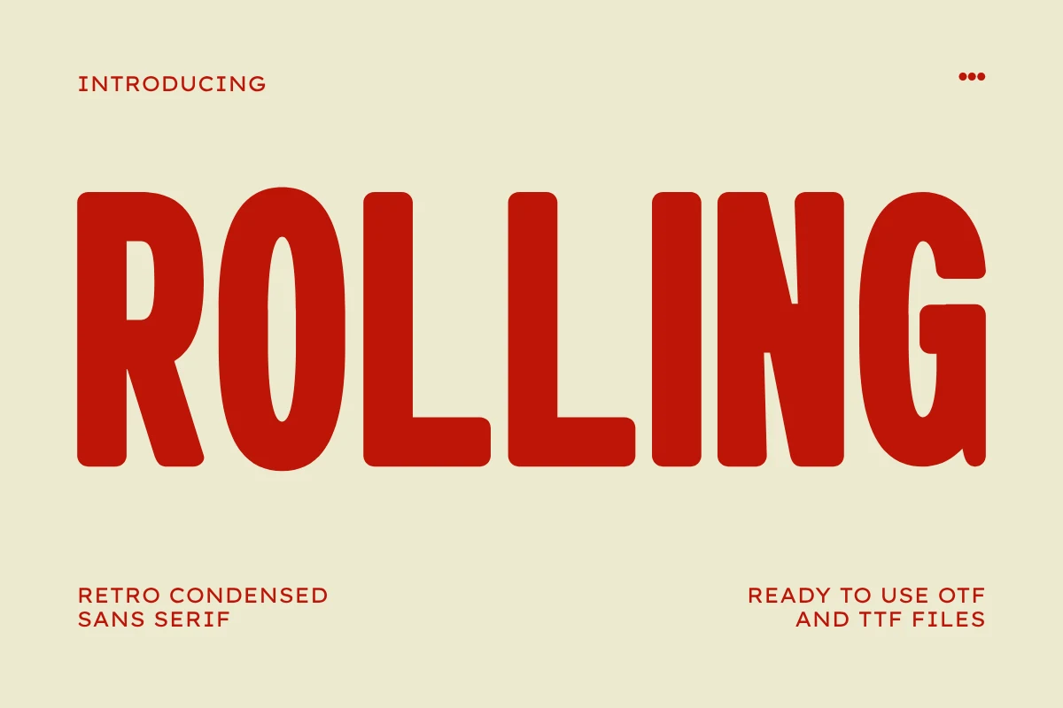
Rolling Font is worth testing for branding, packaging, and posters. Look for rounded letter shapes and narrow proportions when comparing it with other options. Try it at both headline and label size to judge its clarity.
Nura Font for posters
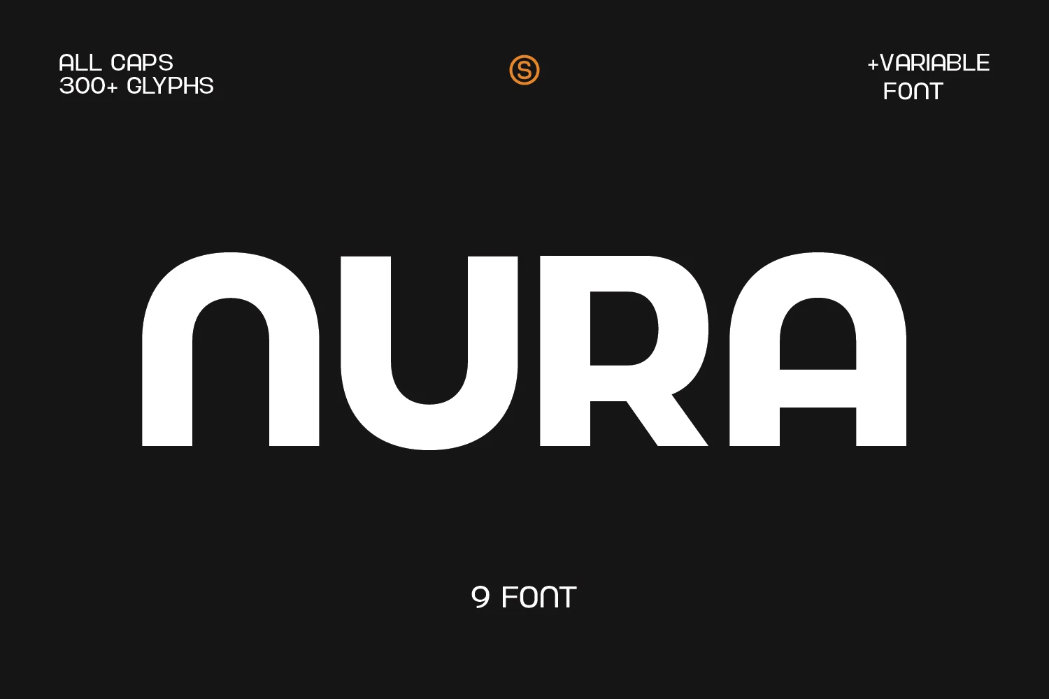
For posters, headlines, and logos, consider Nura Font. Its design draws on rounded letter shapes and geometric construction. Try it at both headline and label size to judge its clarity.
Olline Font for branding
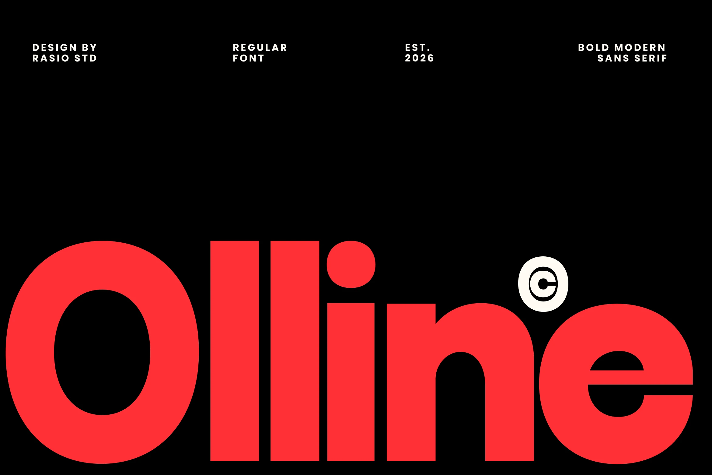
Olline Font can anchor branding, logos, and headlines. The main visual cues are rounded letter shapes and geometric construction. Try it at both headline and label size to judge its clarity.
Modern Heritage Font for branding
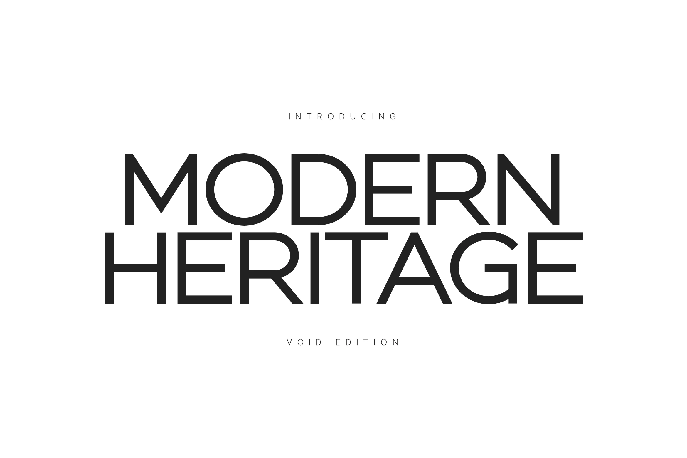
Modern Heritage Font is worth testing for branding, website headers, and headlines. Look for geometric construction and serif details when comparing it with other options. Check whether repeated shapes make short words feel balanced.
Explore Modern Heritage Font →
Borsen Font for logos
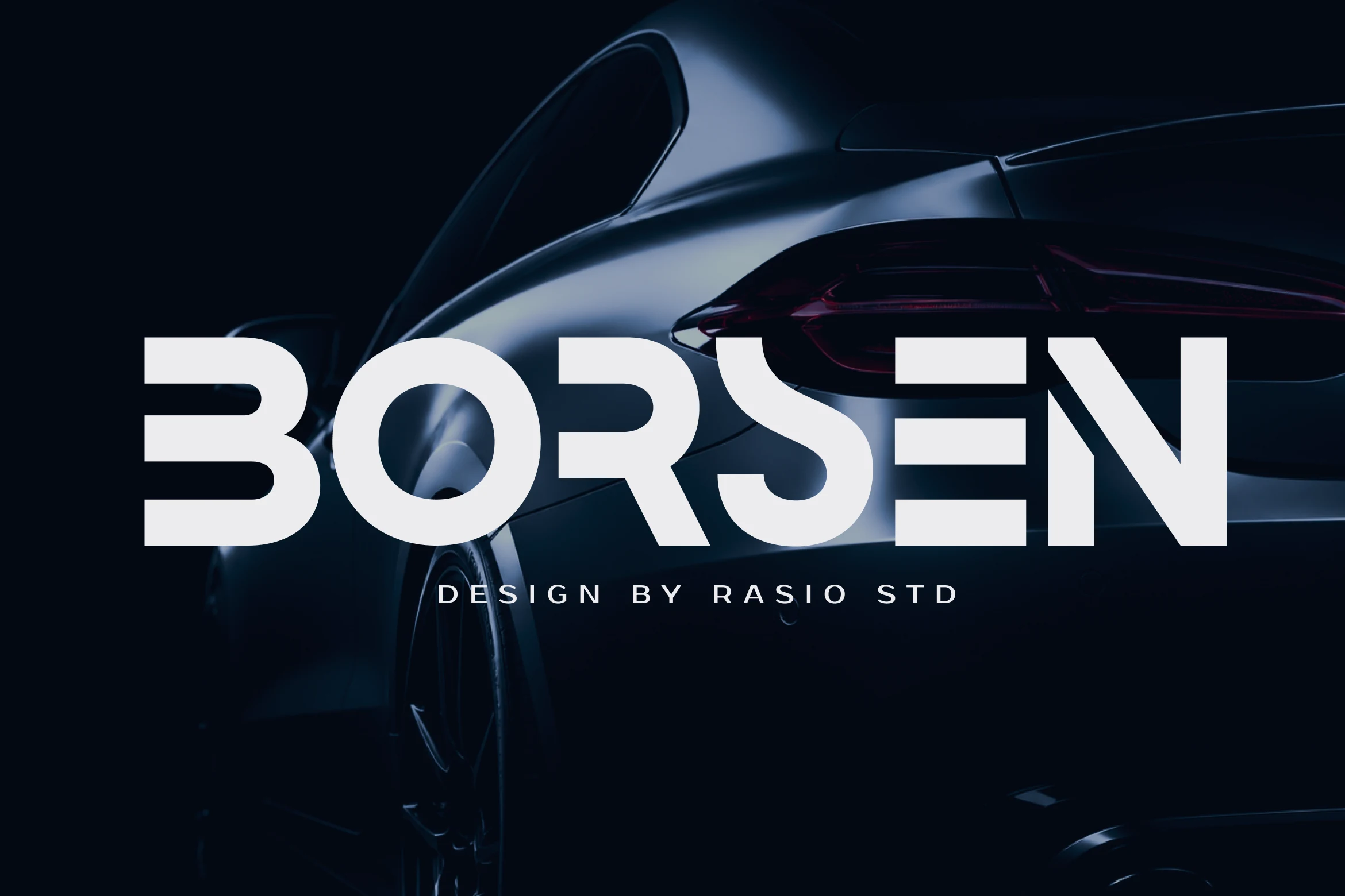
For logos, branding, and packaging, consider Borsen Font. Its design draws on geometric construction and serif details. Check whether repeated shapes make short words feel balanced.
Agilov Font for logos
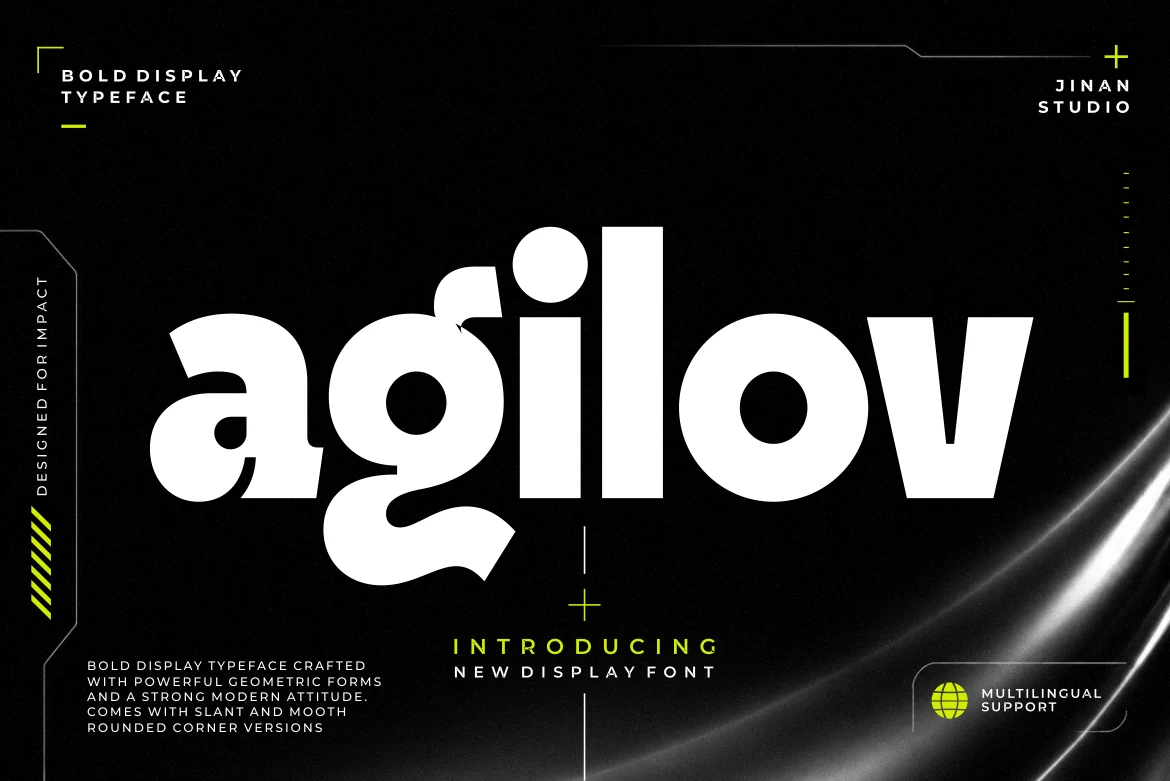
Agilov Font can anchor logos, branding, and posters. The main visual cues are rounded letter shapes and geometric construction. Try it at both headline and label size to judge its clarity.
Montreal Font for branding
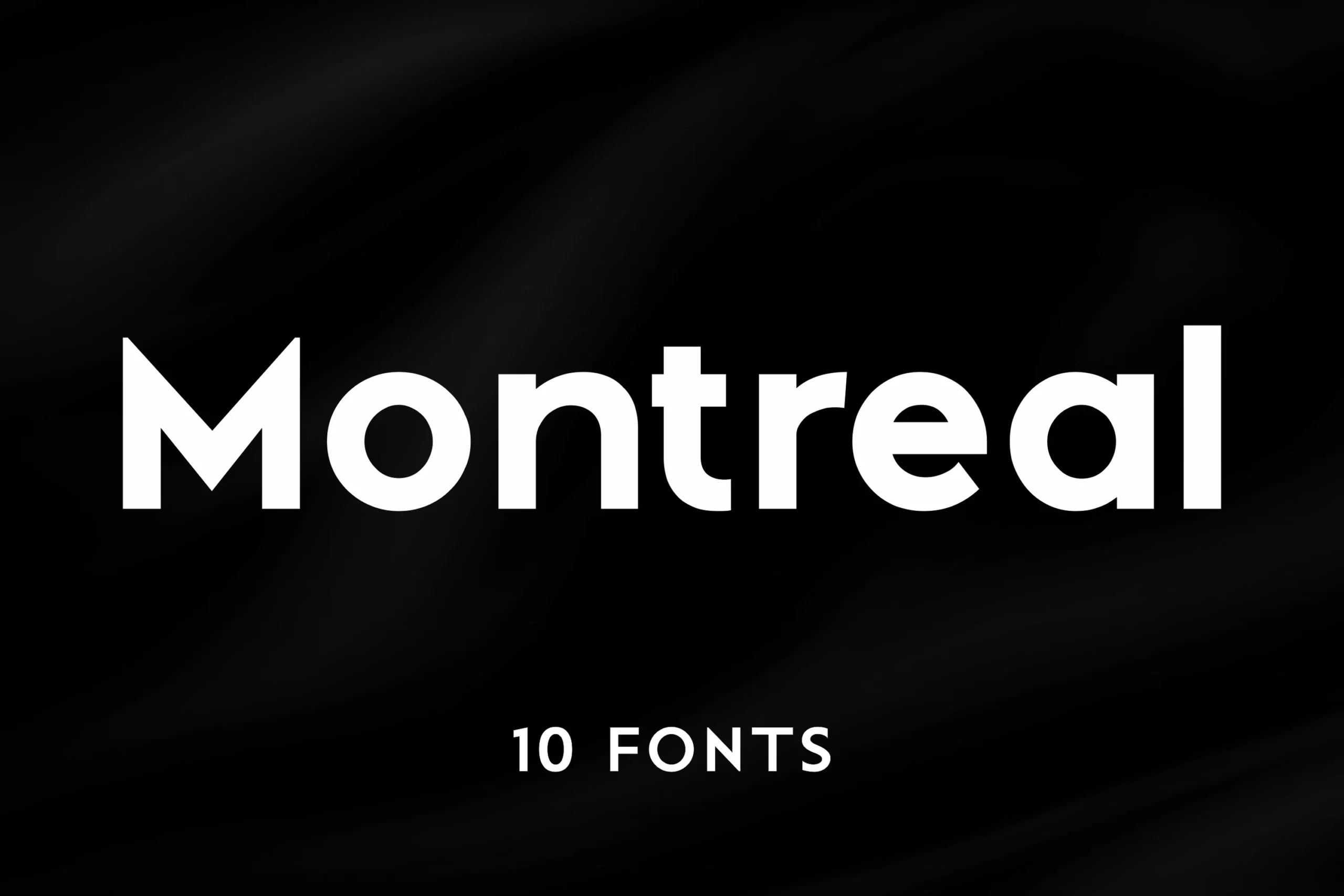
Montreal Font is worth testing for branding, website headers, and display text. Look for geometric construction and serif details when comparing it with other options. Check whether repeated shapes make short words feel balanced.
Vankis Font for logos
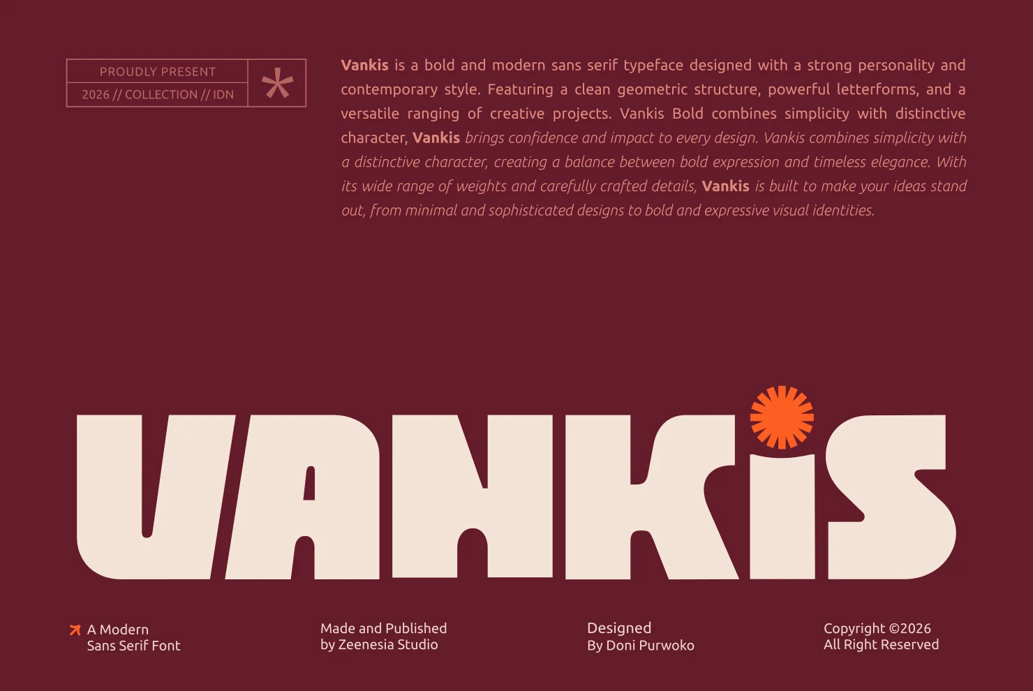
For logos, branding, and headlines, consider Vankis Font. Its design draws on rounded letter shapes and geometric construction. Try it at both headline and label size to judge its clarity.
Heroes Font for logos
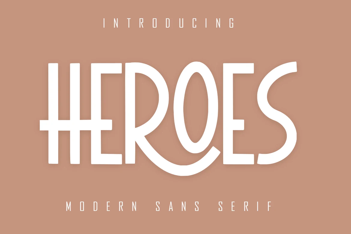
Heroes Font can anchor logos, branding, and invitations. The main visual cues are geometric construction and serif details. Check whether repeated shapes make short words feel balanced.
Sogo Font for logos
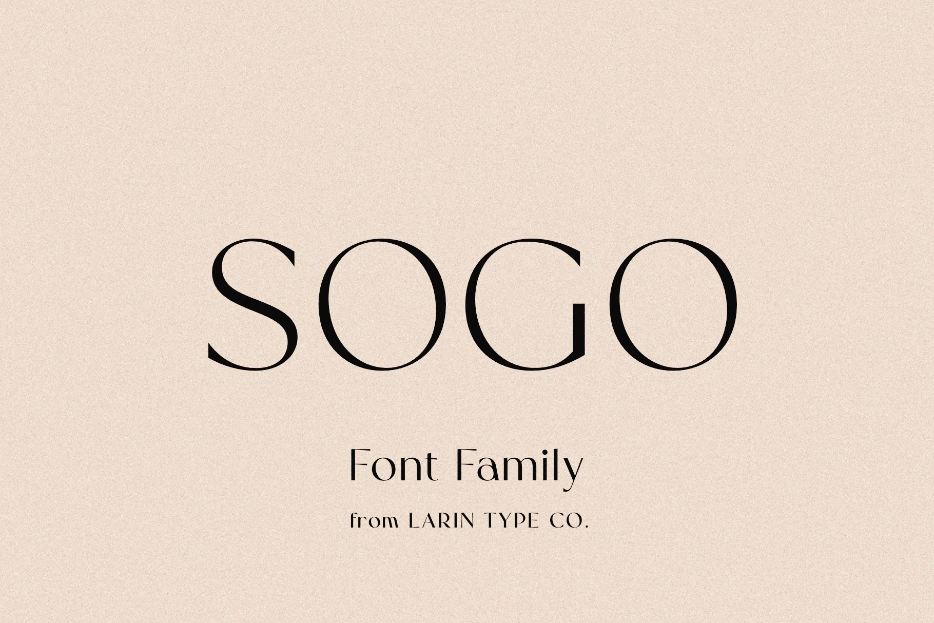
Sogo Font is worth testing for logos, branding, and headlines. Look for serif details and display-focused letterforms when comparing it with other options. Inspect fine details before using it in small print.
Mansory Font for website headers
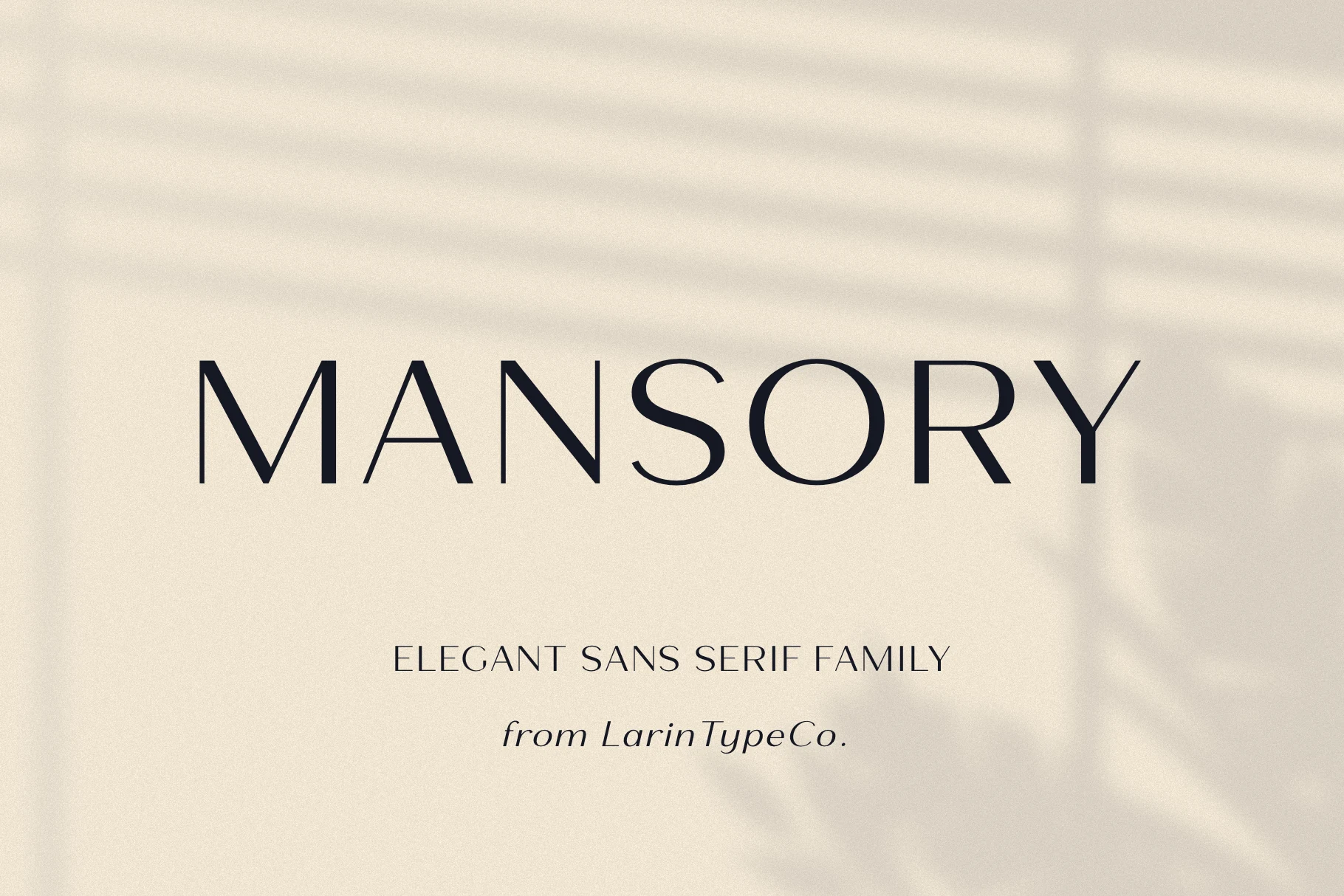
For website headers, display text, and headlines, consider Mansory Font. Its design draws on geometric construction and display-focused letterforms. Check whether repeated shapes make short words feel balanced.
Final checks before using a font
Confirm that the font includes the characters you need and review its current license on the product page. Test the final layout in context: a font that looks striking in a specimen may behave differently in a logo, invitation, website header, or printed label.
Disclosure: This article contains affiliate links to Creative Fabrica. If you purchase through them, fonts.blog may earn a commission at no extra cost to you.